Updated January 2026
Quick summary
More quality website content helps you rank for a wider range of search terms, answers more of your audience’s questions, attracts more organic traffic, and builds your site’s authority; focusing on helpful, relevant content rather than thin pages increases visibility, engagement, and opportunities for conversions.
Why you need more website content in 2026
In 2026, website content is still one of the strongest signals you can give search engines and users about what your business does and who it helps. A single homepage is rarely enough to explain your services, answer questions, and build trust. Well-planned content gives your website depth, clarity, and purpose.
Search engines now focus heavily on usefulness and intent. Pages that clearly solve a problem, explain a service, or guide someone through a decision perform far better than thin or generic pages. More content allows you to cover topics properly instead of cramming everything onto one page.
Additional content also helps you reach people at different stages of their journey. Some visitors are just researching, others are comparing options, and some are ready to contact you. Blog posts, guides, FAQs, and service pages allow you to support each stage without overwhelming your main pages.
From an SEO point of view, more high-quality content gives search engines more context. It helps them understand your expertise, your relevance to specific topics, and how different pages on your site relate to each other. This makes it easier for Google to match your website to the right searches.
Content also builds trust. When visitors see clear explanations, helpful advice, and up-to-date information, they are more likely to stay longer, explore your site, and take the next step. In many cases, good content answers questions before someone even needs to get in touch.
More content does not mean more fluff. In 2026, the goal is focused, helpful, and human content that reflects real questions and real experience. Fewer, better pages that genuinely help your audience will always outperform large volumes of thin or repetitive content.
Why "less is more" is BS when it comes to your website
You’ve probably heard it before — less is more. It gets thrown around like gospel when it comes to websites.
Keep it clean.
Strip it back.
Don’t overwhelm people.
But here’s the thing — for most small businesses, especially if you’re building your own website, that advice can seriously backfire. A stripped-back site with hardly any content doesn’t look sleek and professional. It just looks… empty. And if your visitors can’t figure out what you do, who it’s for, or why they should trust you — they’ll be gone in seconds.
If you’re a small business owner and you’ve built or are managing your own website – this is for you!
It’s time to ditch the ‘less is more’ myth and learn what actually works.
Why is “less is more” so popular?
There are always different trends, one year it’s maximalism, then it’s minimalism, then it’s grey – you get the drift.
Apple uses minimalism for all its products. They are clean, easy to use, and have a very modern feel.
But: you are not Apple! You’re a small business owner and you have your website to show what you offer, build trust and reassure people it’s safe to buy from you.
When it comes to your website, minimalism is the worst thing you can do.
When people visit the Apple website, they already know what they want to buy. They might just want to enjoy the design aspect a little longer and look for the last convincing aspect to convince them to buy the desired product.
They already know Apple. Some people absolutely love Apple. They already trust Apple. They know they want to buy their product.
People who visit your website don’t know you or your business. They certainly don’t love you (yet), and they don’t trust you (yet). In other words, they don’t know (yet) if they want to buy from you.
Large businesses with a perceived minimalistic online appearance have done decades of online and offline marketing and can afford a minimalistic design.
Whether you’ve just started your business or have been offering your services in your local area for a number of years, chances are your business is not the first name that people think of when they hear about your industry or your product.
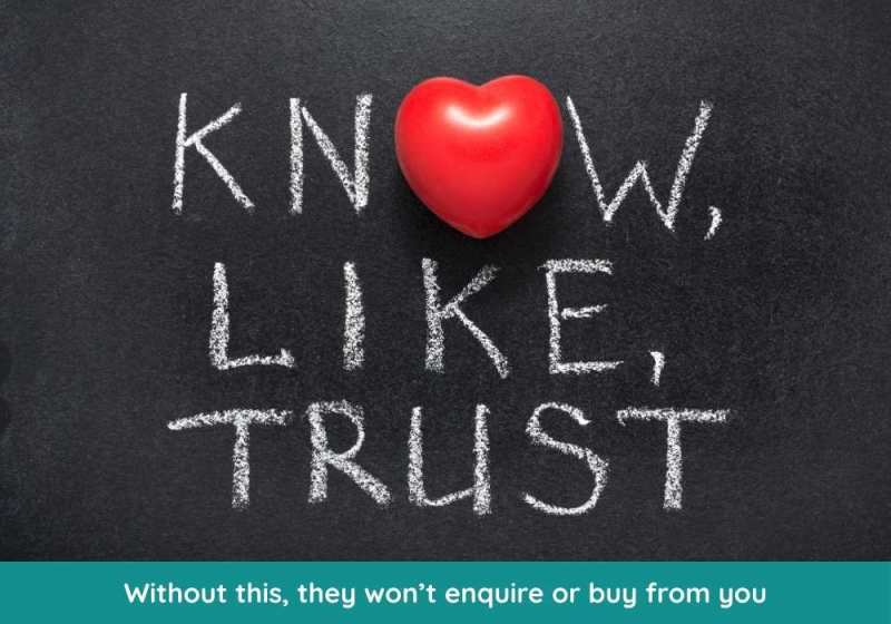
You need to allow potential customers to get to know you, like you and trust you before they feel safe to buy from you.
This can only be achieved with a website that contains useful information that allows strangers to learn about what you do and convinces them to buy from you.
Know – like – trust.
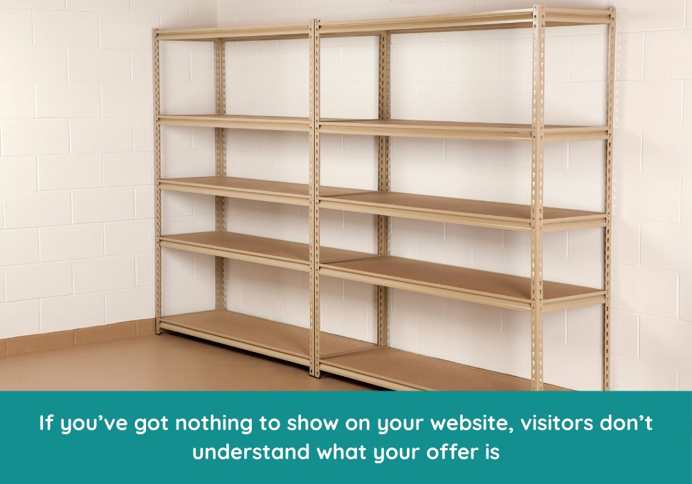
Saying too little is like having a showroom with nothing to show!
You will have visited websites that were possibly beautiful but didn’t tell you anything.
Imagine you’re thinking about converting your garage into a home gym. You head to Google, click on one of the results and land on a stunning website. Sleek design. Big, bold images. Fancy animations sliding everything into view.
It looks impressive… but you realise you’re none the wiser after a few seconds. There’s no pricing information, no clear explanation of how the process works, no real photos of finished projects — just vague promises like “we transform spaces” and “built with passion.”
You scroll around, hoping to find something useful, but you’re stuck in a loop of beautiful fluff with nothing solid to grab onto. So, what do you do? You leave — and click on the next result that actually answers your questions.
The struggle is real – writing website content is hard!
Many solopreneurs (1-person business owners) struggle writing content for their website. You may be a cake maker or the owner of a small local construction company. You’re an expert in your field, but building your website and writing content will be out of your comfort zone. This is OK, but with a bit of help and a clear framework, you can learn what to add to your website. It’s like filling in the gaps.
A lot of advice online says things like this: Keep things clear, say what you do, who you do it for, what makes you different, and what your unique selling point is.
This is good advice, but it still leaves you staring at an empty web page, right?
Why you need more content on your website
Without uselessly inflating this article, let me quickly tell you why you need more content on your website:
- Customers want to find out if your business offers solutions to their particular problem(s)
- Building trust with a stranger takes time – they need to be able to consume more content before they are ready to get in touch
- Without good content, you have zero chance to rank in Google
Keep it as short as possible, but as long as necessary
What your website really needs to include
You will need these pages on your website:
- Homepage
- About us
- Service 1
- Service 2
- Service 3
- FAQ
- Blog
- Contact
- GDPR pages (cookie policy, privacy policy, data protection policy).
Web pages you don’t need as a solopreneur:
- Testimonial page
- Gallery page
- Company history
- Business values
- Mission
The copy trap – why it’s a bad idea to steal ideas from your competitors
Your direct competitors will be small business owners in your area who also don’t know how to build a website, write content and do marketing well (with some exceptions, obviously).
If you look at your competitors’ websites, you are copying their bad ideas. For example, I often get asked why I don’t put a slideshow on the top of the website. Slideshows are no longer a thing and haven’t been since 2015! There are still web designers who add lots of animations and sliders, and for me that’s an indicator for a beginner web designer.
Web design is so much more than putting together a few “flashy” pages, with images flying in from the side, sliders rotating automatically, pop ups popping up and fancy hover effects.
A good web designer should know about CRO, web design best practices, and about what customers want. A good web designer thinks about the customer who visits the website first and builds it to convert strangers into customers.
Just to give you an example: If your target customer is someone in their 50s (and you’re in your early 30s), the text on your website should be bigger to please your potential customers. People in their 50s will likely wear glasses and find it hard to read small text.
Don’t steal from your competitors, steal from industry giants!
When it comes to the competition, don’t look sideways! Look up!
- You’re a jewellery designer? Look at the Tiffany website.
- Running a local boutique? Look at how Zara presents its collections.
- You’re a wedding photographer? Stop scrolling your peers – study Vogue Weddings.
- You’re a small hotel? Take notes from Gleneagles.
- Got a candle business? See what Jo Malone is doing.
- Designing kids’ clothes? Check out what Boden are up to.
Things that make your website unprofessional
Here’s a list of things you should avoid using or putting on your website:
- Tiny text – If people have to zoom in to read, they’ll leave.
- Cluttered layout – No breathing room = stress.
- Too many fonts or colours – Looks messy, not creative.
- Missing GDPR pages
- Outdated copyright year in your footer – Instantly shows neglect.
- Broken links or error pages – Frustrating and lazy.
- Low-quality or pixelated images – Feels cheap.
- No mobile optimisation – It’s 2025. More than 60% of your visitors will look at your website on their phone!
- Flash animations – Are you stuck in 2008?
- Autoplay music, slideshows or videos – Immediate exit material. Anything that moves on your website people instantly associate with an ad and ignore it!
- No clear call to action – If people don’t know what to do next, they’ll do nothing.
- Missing contact info – Looks shady.
- No HTTPS / padlock missing – Feels untrustworthy.
- Using ‘Click here’ instead of meaningful links – Bad for users and SEO.
- Overuse of stock photos – Especially the cheesy corporate kind.
- Out-of-date blog posts or news – Looks abandoned.
- Under construction pages – Just don’t publish them yet.
- Pop-ups on load, especially with no X – Big red flag.
- Too much jargon – Confuses or bores your ideal customer.
- Big blocks of text with no headings – Hard to scan, hard to care.
- No social proof or testimonials – Missed trust-building opportunity.
- Unresponsive buttons or forms – Poor user experience.
- No brand personality or tone of voice – Feels soulless.
- Old-fashioned design trends – Like bevelled buttons, shadow overload, or spinning icons.
- Generic placeholder content – Yes, people do notice ‘Lorem ipsum’.
- Social media feeds – Are no longer a thing!
- Social media icons in the header of your website – these are exit buttons. Once they’re on social media, you’ve lost them! Show these icons very small and faint in the footer.
Let’s get into the nitty gritty – what content your website really needs
In the following few paragraphs, I explain the different sections each page on your website needs.
What content goes on your homepage
This is what your homepage needs:
- A headline that summarises what you do and where (and possibly who for)
- An introductory paragraph that clearly says what you offer.
- A list of services you provide with an image, a short sentence and a button that links to each specific service page.
- A short section about you and/or your business with a photo of yourself as well as a button that encourages people to look at your about page.
- You should show a couple of testimonials (but no testimonial sliders, please! Here’s why).
- Show badges or logos of associations you’re a member of and/or logos of websites where your work has been published. This is huge for trust building.
- If you have many reviews on a trusted review website such as Trustpilot, show them their widget so that people can see that your business is trusted by many.
- Show precise contact details, such as a phone number and a link to your contact form. This is essential for building trust. Business owners who hide their contact details come across as having something to hide!
- Show a small contact form at the bottom of the page.
What your service page needs to include
So here’s the bad news: If you offer several services, you must have one page per service! Why?
- People can click on the particular service they are interested in and learn more about it. For example, someone looking for a wedding cake doesn’t want to read details about cake making classes.
- You have a much higher chance of ranking on Google if your services are split out on different pages.
- A service page that combines all the different services on one page is unlikely to rank in Google.
For example, if you’re a cake maker and offer wedding cakes, birthday cakes, cake-making classes, and cupcakes, you would need to create four different service pages.
Sorry, more bad news: Each service page will be very long! I.e. with lots of content!
But if you follow this framework, it will be like filling out a form, and you will be done quickly.
Something important to note before you get started:
Google does not rank websites! Google ranks web pages! Therefore, every page must be treated like the first page someone sees when visiting your website.
This is what your service page needs, in this order:
- An intro paragraph repeating what you do, who you do it for, and where. This is important for SEO and for people who have just landed on your website from Google, and this is the first page they see.
- Badges of associations or organisations you’re a member of, any logos of websites you’ve been published on.
- A couple of testimonials (yes, just 2!)
- A detailed step-by-step list of how you do the work. This explains to the visitor what to expect.
- Add a clear pricing section. If you offer bespoke services, add a price range or “price from.” This will allow people to understand how much things cost and whether they can afford them.
- A list of 10-15 FAQs related to this service. Don’t answer generic FAQs about payment terms here, only service-related ones. Write these as questions.
- A list of 10-15 common concerns people have about your service. Write these as a statement, such as “I am worried that…”. Then address each concern and how you would handle the problem in your business.
- Show a gallery of your work – but keep it to 6-9 images. You can add several smaller galleries on this one page. It’s better to have 3 galleries with 6 images each than one long gallery with 60 images. The majority of people will look at your website from a mobile phone, how long would they have to scroll through 30 or more images? Adding galleries with fewer images but several sprinkled through each service page is better.
- Add a short about us section at the bottom of the page – similar to the homepage. Add a “Learn more” button that links to your About page. Include a photo of you here.
- Finish the page with two more testimonials.
- Then, add a contact form. Do not add a button that says “Enquire now”. Add the contact form straight away at the bottom of each service page! Each button people have to press adds friction. You want to remove friction as much as possible.
Don’t add content for content’s sake! Less Is Not More — More Is More (When Done Right)
Regardless of what you sell, people have questions. It’s so easy to find questions people have about your product or service. Head over to Amazon and look at bad reviews, check out Reddit, Quora, use ChatGPT. There’s no excuse in having a thin website that lacks content and substance.
Let’s go back to our garage conversion example. Create a good page that explains the different stages of the garage conversion process. Then add FAQs that are relevant to the service and discuss people’s concerns. The more questions you answer on your website, the more likely people will send you an enquiry!
63% of consumers expect businesses to know their unique needs and expectations, while 76% of B2B buyers expect the same thing.
What goes on your FAQ page
You should have a main FAQ page that answers questions about doing business with you. For example how to pay, delivery times and rates, warranty etc.
Your service pages on the other hand should include FAQs that relate to the specific service.
Remove your testimonials page
People don’t read testimonial pages. Why? Because it’s about you and not them.
Turn every page of your website into a testimonials page. Include a few testimonials on each page – especially your homepage and your service pages.
Avoid using testimonial sliders.
Amend your testimonials or reviews and only show the “juicy bits”. Remove the waffle. Protect your customer’s identity and only mention their first name, or say Julia S., Manchester.
Your website isn’t for showing off minimal design — it's there to convert and inform.
Request a website review
Adding more content to your website isn’t just about filling space – it’s about helping your ideal customers find you, trust you, and take the next step.
A well-planned content strategy can boost your visibility in search results, improve user experience, and make your site work harder for your business.
If you’re not sure what to write or how to structure your content, you’re not alone – and that’s where a website review can really help.
My website review is a paid one-off service where I record myself going through your site highlighting exactly what’s working and what needs improving.
You’ll get a 15–30 minute video you can download and watch as often as you like, along with a clear, easy-to-follow to-do list in PDF format.
It’s a great way to get expert feedback, tailored to your site, so you can move forward with confidence and make meaningful improvements.