Updated January 2026
Quick summary
A contact form should balance collecting useful information with keeping it easy to complete: include essential fields like name, email, and message, add relevant optional fields like phone number or subject when needed, and avoid asking for too much detail up front so you don’t discourage submissions while still capturing what you need to respond effectively.
Contact form fields that work best in 2026
A good contact form gets the visitor to hit “send” with as little effort as possible, while still giving you enough detail to respond properly. The sweet spot is a short form with optional extras that only appear when they’re needed.
The essential fields for most businesses
- Name (or first name): So you can reply like a human.
- Email address: The simplest way to respond and send follow-up info.
- Message: A single open text box so they can explain what they need.
Useful extras (only if they genuinely help)
- Phone number (optional): Only make this required if calls are your main way of working.
- Service needed (dropdown): Helps you route enquiries and reply faster.
- Preferred contact method (email or phone): Reduces back-and-forth.
- Preferred contact time (optional): Handy for trades, clinics, and busy diary-based services.
- Location or postcode (optional): Useful for local services to confirm coverage.
- Budget range (optional): Helpful for projects, but keep it optional to avoid drop-off.
- File upload (optional): Great for briefs, screenshots, photos of a problem, or examples.
Use conditional fields to keep the form short
If you offer multiple services, use a “Service needed” dropdown and only show follow-up questions when someone selects an option. This keeps the form clean while still collecting the right details.
Privacy, consent, and trust signals
- Short privacy note: Tell people what happens next and that you won’t share their details.
- Consent checkbox (only if needed): Use it if you are adding them to marketing emails. For simple replies, consent is not usually required.
Spam protection that does not annoy real people
- Honeypot field (invisible to users): Often enough for small sites.
- Rate limiting: Stops repeated submissions.
- Captcha only if spam is a real problem: Use the least intrusive option you can.
Small details that improve completion rates
- Clear labels and simple field names.
- Only mark truly required fields: Too many required fields reduces submissions.
- Mobile-friendly inputs: Use the correct keyboard types for email and phone fields.
- Helpful error messages: Say what to fix in plain language.
- Confirmation message: Tell them the message was sent and what happens next.
A simple recommended setup
If you want a safe default: Name, Email, Message, plus an optional dropdown for “Service needed”. Add phone number, budget, or postcode only if it helps you qualify enquiries or respond faster.
How to design a contact form your customers want to fill in
Most websites have a contact form because you want potential customers to get in touch easily.
The main goal of your contact form is to collect information from visitors to allow them to be converted into customers.
There are two things at play here:
- You want to know as much as possible about the person filling in the form.
- A stranger visiting your website wants to spend as little time as possible filling out a form and doesn’t want to give away too much information too quickly.
The main and only thing a contact form has to achieve is to get a new customer across the line - from being a stranger to someone with a name and email address who wants to speak to you!
Often, the contact form is one of the last things people look at when working on their website. It’s often an unimportant afterthought that – by some web developers – simply gets ticked off, and by people who develop work on their website, done at the minute without much thought going into it.
A contact form is important as it’s the first “door” a potential customer walks through to speak to you.
Therefore, your contact form needs to be secure and look professional. It should have as many custom fields as you need but as few form fields as possible.
Getting someone from your website service page or your blog to visit your contact page took effort. You crafted your website content so that strangers want to reach out to you, give you their details and learn more about your products and services.
Let’s discover how to create a contact form your users will love and fill in. You will also learn about things to avoid when creating a contact form on your website.
Who are you hoping to speak to? Who is your target customer?
When you speak to a marketing expert, they should always lead with this question: Who is your target customer?
You should have a rough idea of who you aim to speak to with your website content. Let me show you a few examples:
- A time-poor CEO of a construction company
- An HR consultant working for an HR agency
- A bookkeeper who runs their own business
Why is having a target customer important?
Understanding your target customer will influence the design of your contact form (and anything to do with customer communications).
If you know the type of person you want to speak to, you will create a specific contact form.
There’s no one-size-fits-all contact form, but look at your target customer’s needs.
Let’s say you’re a health and safety training provider targeting time-poor CEOs of construction companies. The CEO has studied your website and is ready to contact you.
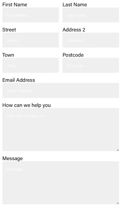
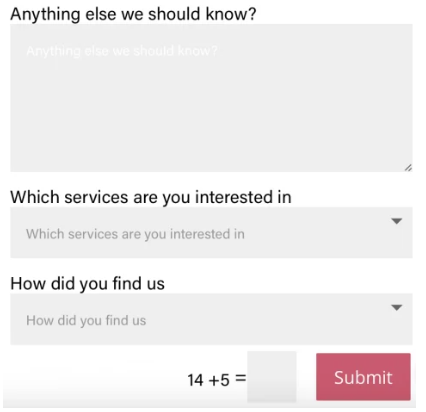
Which of the below contact forms will they be keen to fill in?
Give your contact form a KISS – declutter your contact form
KISS stands for Keep it super simple!
As you’ve seen in the two examples above, contact forms can easily contain way too many fields and your potential new customer loses the will to live – having to fill in all those details.
In my experience, contact forms with just 3 fields convert the best! Name, Email, Message.
Declutter your contact form as much as possible.
In this example, the contact form has the following fields:
- First name
- Last name
- Website
- Company name
- Message 1
- Message 2
- How did you find us
- Telephone
Having fewer contact fields can significantly increase the conversion rate of your contact form! Don’t believe me? Check out this article from Quicksprout.
Also check out the below infographic from Quicksprout:
First contact form example
Second contact form example
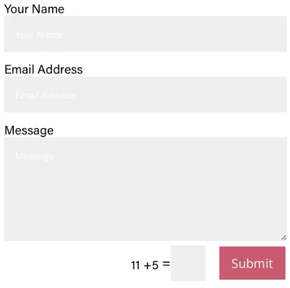

If a potential new customer sees a contact form with too many fields, they can simply just say “nah, don’t have time for this”.
Reduce the number of fields, keep your contact form clean, remove friction.
Friction? Always ask yourself – would your new contact wonder why you need this particular information? Save them time and get yourself a new client by keeping things simple.
Here’s the statistics – conversion rates of contact forms:
- 3 fields: 25%
- 5 fields: 20%
- More than 6 fields: 15%
The conversion rate drops even further if your contact form has more than one text area field (source: Hubspot)
Look at what's typical in your industry and experiment with different options. Your type of business might need a longer contact form!
Check out this study which shows improved results with longer contact forms.
A contact form with only 3 fields? We will get inundated with enquiries by customers who are not right for us
Your website should contain information that prequalifies potential customers, encouraging the right customer to get in touch. Here are a few elements you can showcase on your website to encourage the right customers to contact you, while deterring those who might not be the best fit:
Clear benefits: Highlight the unique benefits and solutions your business offers. This can attract customers who are seeking exactly what you provide and may discourage those who are looking for something different.
Target customer specifics: Clearly define who your products or services are meant for. Call them out and mention them on your website, for example as an HR consultancy, you could say that you mostly work with companies that have at least 10 employees.
If possible show your price: Show your price on your website to pre-qualify leads. Serious customers who have seen your price information and who can afford you are more likely to contact you. Customers on a budget well below your price range are much less likely to contact you.
Case Studies or Success Stories: Show real examples of how your products or services have benefited previous clients. This can resonate with potential new clients who are looking for proven results. If you only mention customers (or types of customers) you’ve helped in a certain industry and of a certain business size, businesses who don’t fulfil these criteria are less likely to fill in the form.
Complexity Indicators: If your products or services are complex or require a certain level of expertise and/or experience, you can show this on your website. For example, if you’re an accountant that exclusively works with customers using a certain accountancy product, you can mention this product frequently on your website. Micro business owners who use a free bookkeeping software are less likely to contact you because they realise you’re only working with larger, specialised businesses.
Educational Content: This one is super important but still not many businesses take the time and invest in education website content. Insightful blog posts, how-to videos, guides related to your industry – all of these can make a difference. Not only will they save you huge amounts of time in the future because you’ve already answered them for your customers, but it will also help website visitors who are not the right fit for your business to learn more about the type of client you work with. You can also provide education content on your website for businesses who are not the right fit. You can be super helpful suggesting alternatives to your solution. They will (hopefully) keep you in mind and if their business is growing, they might come back to you!
Professional Language and Tone: Craft your website content in a tone that resonates with your ideal customers. The language you use can naturally resonate with your target audience and discourage those who do not relate to it.
Limited Availability: Most businesses are out there to get more customers. But more customers are not always better. Showing limited availability or a waitlist for your services can increase demand. This can encourage serious customers to act quickly while discouraging those who are not committed.
How to design a contact form
Here are a few simple suggestions for improving your contact form and making it more user-friendly.
- Use clear and easy-to-understand field labels
- Use fewer Fields: Keep the number of fields minimal to reduce user effort and increase form completion.
- The order of the fields: Place important fields first to capture essential information upfront.
- Error Messages: Provide clear and friendly error messages to guide users if they make mistakes.
- Mobile-Friendly: Ensure the form works well on mobile devices, making it easy for users to complete.
- Secure Captcha: Add a simple captcha or reCAPTCHA to prevent spam submissions.
- Inline Hints: Include helpful hints within the form fields to guide users while filling out the form.
- Visual Contrast: Use colours that make the form stand out while still aligning with your website’s design.
- Engaging CTA: Craft a compelling call-to-action button that encourages users to submit the form (avoid labelling the button “submit”)
- Privacy Assurance: Mention a brief statement about data privacy to build user trust.
- Thank You Page: Redirect users to a thank you page after submission, confirming their message was received.
- Test Regularly: Regularly test the form to ensure it’s working properly and check for any user experience issues.
- Going one step further – set up “goals” in Google Analytics to measure your contact form conversion rate.
Implementing these suggestions can create a more user-friendly and effective contact form on your website.
Design your contact form with your brand colours
Have you been on a well-designed website and when you look at the contact form it looks like an afterthought?
When designing your contact form, you brand fonts and your own brand colours so that the form looks like it belongs there. You can use graphics and background colours to make the form visually appealing.
Best contact form button label
Many websites use a template or pre-built form functionality, which can then be amended to suit the business requirements.
The pre-built contact form will have a “submit” button, often labelled “submit”.
In English-speaking countries, the term “submit” can have an entirely different meaning!
Using the label “Submit” for a contact form button is functional, but it’s not engaging and lacks clarity that can make the visitor want to take action. Here are a few reasons to change “submit” to a more engaging and descriptive label:
- Clarity and Context: “Submit” is a generic term that doesn’t provide much context about what happens when the user clicks the button. A label like “Send Message” or “Get in Touch” provides a clearer idea of the action the user is taking.
- User-Focused Language: Labels like “Submit” focus on what the user is doing for the website (submitting data), whereas labels like “Get in Touch” or “Request Callback” focus on what the website is doing for the user. This user-centric language can encourage action.
- Psychological Impact: Engaging labels can evoke a sense of curiosity or anticipation, resulting in higher click-through rates. Users might be more motivated to click a button that promises a specific positive outcome.
- Trust and Reassurance: Descriptive labels can reassure users that their action is meaningful and will lead to a response. Labels like “Send Inquiry” convey that their message will be seen and addressed.
- Branding and Personality: Using a unique and engaging label can contribute to your website’s branding and personality. It can make your contact form feel friendlier and more approachable.
- Mobile-Friendly: On smaller screens, using a shorter label can prevent the button from taking up too much space while still conveying the necessary information.
- A/B Testing Success: Many usability tests and A/B tests have shown that labels other than “Submit” often perform better regarding conversions. People might subconsciously associate “Submit” with forms that require personal information, making them hesitate.
Examples of alternative labels include “Send Inquiry,” “Get Started,” “Request Callback,” “Reach Out,” or “Let’s Connect.” These labels are more inviting and action-oriented, making the website visitor feel more comfortable and motivated to contact you.
How to create a mobile friendly contact form
Since 2014, more people access websites on their mobile phone than on a laptop or computer. Having a mobile friendly contact form is super important in order to reduce frustration and allow website visitors to contact you.
Here are a few things to consider:
- Responsive Design: Ensure the form layout adjusts smoothly to different screen sizes.
- Compact Layout: Design the form to fit well within smaller screens without excessive scrolling.
- Large Fonts: Use legible font sizes for easy reading and interaction on mobile devices.
- Touch-Friendly Fields: Make input fields big enough to tap accurately with fingers.
- Single Column: Arrange form elements in a single vertical column for straightforward navigation.
- Minimalist Design: Keep the design simple with fewer elements to avoid clutter.
- Dropdowns and Radio Buttons: Use these to save space instead of long lists of options.
- Smart Default Keyboard: Set the appropriate keyboard (text, email, number) for each input field.
- Clear Labels: Use concise labels that explain the purpose of each field clearly.
- Inline Instructions: Place hints or instructions within the fields when needed.
- Efficient Validation: Validate user input in real-time and provide clear error messages.
- Readable Captcha: If using a captcha, make sure it’s mobile-friendly and easy to interpret.
- Scrollable Terms: If terms are provided, make sure they are scrollable on smaller screens.
- Mobile-Friendly CTA: Ensure the submit button is large enough and easy to tap.
- Test Across Devices: Test the form on various mobile devices to ensure consistent usability.
How to encourage website visitors to fill in forms correctly?
Have you ever encountered a contact form and must correct a few of your entries before the form can be submitted? Frustrating, right?
Some contact forms “force” users to provide the information in a correct format. For big companies that receive 1000s of messages every day, for example, power companies that receive gas and electricity meter readings, it’s essential to validate the input as the form data is automatically submitted into a system that then calculates customer invoices.
However, for a small business website, you don’t need to go overboard with the validation of the form fields.
You can use the little * symbol to show the user that a particular field is a required field, such as name and email address, and you can set up a telephone field to only allow numbers to be entered. Some form builders can check the email field if a correct email address has been entered. Form builders, such as the WordPress Contact Form 7 Plugin, allow you to create additional fields, add a default value for a field, you can set a field to be a required field or an optional field.
If the user has not filled in a form correctly, you can show a friendly message that either information is missing or hasn’t been entered correctly (for example, if someone forgot to enter the @ in the email address field).
KISS – Keep it simple and be prepared to receive unpolished data to get a new lead over correct data, but fewer leads because they find filling in the form frustrating and time-consuming.
How to show a thank you message after someone submits a contact form?
Modern websites allow setting up a contact form with additional functionality, such as displaying a success message after the form was submitted or even redirecting to a thank-you page. The latter is particularly useful if you want to capture the “event” in Google Analytics and see how well a contact form converts.
Since the thank-you page is not displayed in the Google search results (and you can set up the page to be excluded from the search), you can check in Google Analytics how often the thank-you page was opened in a specific time frame. This is the number of times a form was submitted!
Should you use Captcha in your contact forms?
Captcha is meant to help reduce spam submissions as they ask a human being to perform a simple mathematical equation or pick a specific image from a group of pictures.
There are different captcha versions available. Google Captcha is free to use and the current Version 3 is an “invisible” captcha. The user doesn’t have to pick pictures, but the browser checks if a human is entering data or a bot.
Inbuilt captcha, such as mathematical equations, don’t help much in preventing spam submissions. It’s best to use a professional service.
How many contact forms do you need?
Many small business websites just have one contact form.
Visitors expect to see the contact button on the top right of a website – over the years this has become website “best practice”. Additionally, I’d always recommend providing a link to your generic contact form in the website footer.
Isn’t one contact form enough?
Put yourself into your customers’ shoes. You’re spending time on your website, exploring a certain product or service, you’re reading a long page and now you want to know more and get in touch with the company.
They now have to scroll up, find the contact button and then see a generic form.
Wouldn’t it be better if they saw a specific contact form at the bottom of the page they’ve just read and enquire about this particular product or service?
Let’s say your company offers fencing, patios and driveway installation services. Someone is looking for a new garden fence. They’ve explored different options and they now know they want a timber fence for their home. They’re ready to contact you. For your potential new customer, it would be best if they read your content and at the bottom of the timber fence page they see a contact form that asks them this: “Are you ready for your new timber fence? Get in touch for a free quote”. Then show them 3 fields: Name, Email, Message.
You can set up the form so that the message you receive contains a hidden field that tells you that the form was submitted from the timber fence page.
When you email them back, you already know they are looking for a timber fence and you can start the conversation and then ask for more details.
Setting up a contact form is super easy. I’d recommend a user-centred approach by providing a contact form on every page on your website – not a generic contact form, but one that is customised around the service or product on the page they’re currently reading. More effort? Yes. More reward? Definitely!
Should you ask the user where they found you?
You will have seen a drop-down like this in a contact form: How did you find us?
I agree: it’s super important to know how a customer found out about your business. But you don’t need to bother them with this question in the first conversation. Once you’re talking, you can casually ask this question – on the phone, for example. People are happy to tell you, but to add this to a contact form is only adding bulk and something else the user has to tell you. They might not want to tell you this, and also, answering this question is irrelevant to the visitor. This question is “me” centred and not user-centred.
The boring bit – GDPR, Privacy and Security Assurance
Different countries have different requirements for privacy information. Make sure that your contact form shows a link to your data protection and privacy policies. You can even include a tick box in your contact form where people can say they’ve read these policies. Keep this simple, as adding a huge paragraph about privacy and data protection can be off-putting. You can also keep this “light-hearted” by saying you won’t be selling their details, and they’re not automatically added to a mailing list, for example.
How to test a contact form
When you set up a contact form, there will be a section where you can enter an email address to which the form is sent after it’s been submitted. Enter your email address in there and send yourself an enquiry.
When you send yourself a test enquiry, use a different email address than the one you entered (where the form is sent to), which can cause the form to malfunction. In the email address field (on the front end), you can enter any random email address when submitting your contact form for testing purposes.
Fill in each form field and then check that the form submission is working correctly and what message is displayed after a user has sent it. Also, check that you receive the form details correctly in your inbox.
Some website systems automatically collect and store submitted forms so that you have a “copy” of the enquiry in your website dashboard.
Check your spam folder regularly as sometimes enquiries can disappear into the Junk folder, and you don’t want to miss out on a potential new client opportunity.
Contact form testing – Changing your contact form if it does not attract enquiries
When you start looking into the topic of “conversion rates”, you’ll easily disappear down another rabbit hole of marketing 🙂
Generally speaking, the conversion rate of a website is the percentage of visitors that do what you want them to do and they turn from a “visitor” into a “lead” or “customer”.
There are different conversions, such as filling in a contact form, making a purchase, downloading a PDF, signing up for a trial, downloading a mobile app, making an appointment and others.
It’s very easy to calculate your conversion rate:
Conversions divided by Sessions equals conversion rate.
For example:
- In August 2023, your website had 70 unique visitors.
- Of those, 30 visited your website twice, resulting in 100 sessions.
- Your ebook was downloaded 5 times.
- Your conversion rate is 5%
You can see the number of sessions for any given period in your Google Analytics account or your website statistics software if you don’t use Google Analytics. (A session is the time a single user spends on your website. If the same user returns the next day, a new session is created; therefore 1 user = 2 sessions).
In WordPress, for example, you can install a counter that tells you how often a PDF was downloaded, or you use the Thank-you page tracking described above.
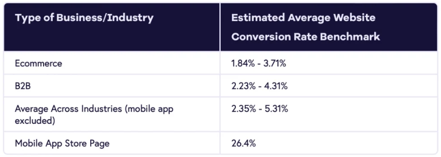
Check out this table from the Geckoboard website about “standard” industry conversion rates.
Contact form plugins
Website platforms, such as Wix or Squarespace, provide a contact form template and contact form builder. If you have a WordPress website, you can easily download a contact form plugin via your WordPress Dashboard. Most plugins allow you to create a simple contact form with a number of default fields, a message field (or text field). Furthermore, you can add placeholder text into the fields which provide more information to your potential customer, providing a better user experience.
Don’t make your contact form an afterthought – it’s the gate a stranger steps through to become a customer! Check here for Elementor’s top WordPress contact form plugin suggestions.
With WpForms Lite you can create a simple contact form. If you’re looking for a beautiful multi step form, where people enter some information and then they step to the next page or part of the form – you may need to buy a paid plugin.
Design a contact form your customers want to fill in
An effective contact form bridging the gap between your business and potential customers. Its primary objective is to gather information that could transform visitors into valuable clientele. Balancing these goals is crucial, as you aim to extract relevant details from users while respecting their time and privacy.
Understanding your target audience is crucial. Your contact form design should align with the needs and preferences of the individuals you aim to reach. Streamlining the process while minimising fields demonstrates respect for their time and encourages engagement. The key lies in striking the right balance between collecting necessary information and avoiding overwhelming visitors.
A mobile-friendly design is equally vital. As mobile device usage surges, a responsive form ensures ease of use across different screen sizes. Legible fonts, touch-friendly fields, and minimal scrolling create a seamless experience. A user-centred approach encourages engagement, and a clear, concise form label (avoiding “Submit”) enhances the action. By embracing these strategies and customising your form’s appearance with brand elements, you can elevate your contact form from an afterthought to a compelling gateway for potential customers.