Quick summary
Website slideshows look fancy, but they usually make your site less effective. Most people don’t stick around long enough to watch them, the key message gets missed, they slow your site down (bad for UX (user experience)+ SEO), they can be awkward on mobile, and they often distract from the one thing you actually want visitors to do: take action. A simple, clear hero section with one strong headline and CTA works better.
Stop the website slideshows…
You are looking for a chiropodist in your area and finally find a website that opens and then you’re presented with a slideshow of the treatment rooms and someone’s feet. Nice!
Slideshows on websites today are like cassettes, records, or CDs.
Even though they cause some of us to be a tiny bit nostalgic, they don’t run the show anymore.
Website slideshows should be on that list.
Every time I start work on a new website, many clients ask to have a slideshow. The client is always right, right? I want their website to be successful, attract customers and not bore people. So I explain why slideshows are bad.
Here are the top 7 reasons, why you shouldn’t have a slideshow on your website:
1. Your message is unclear
Let’s say you have a slider at the top of your website’s homepage. Each slider shows a different message and button (call to action). This just means you’re unsure of your main message and therefore you need to split it and show different messages.
This confuses your visitors and gives them too much choice to click on (for those that actually watch or click through a slider).
2. Only 1% of users click on a button in a slider
The statistics speak for themselves. Clicking on something might mean the “next” button or a button in the actual slider. Only 1% of visitors clicked! And of those 1% – 84% clicked on a button on the first slide.
For example:
- Your website gets 10,000 visitors a month.
- Of those, 100 visitors clicked on a slider interaction
- 84 clicked on something on the first slide.
- That means only 16 of your 10,000 visitors click on something on the following slides!
3. Slideshows slow down your website
The images are usually bigger across the whole screen. Also the whole slideshow needs to be loaded.
This can mean a vastly reduced website load time which in turn affects your google rankings.
Check your website speed with the Google Page Speed tool. Your mobile page should be way above 50 and your desktop should be close to 100.
4. Slideshows are a poor way to present your content
Slideshows are a poor way to present content on the homepage.
Furthermore, they annoy your website visitors and reduce visibility of your content (check out this blog for more information).
5. People think it’s an advert
Because it moves, people think it’s an ad and they ignore it. Try and read this article about WordPress the Forbes website without getting annoyed…
6. Too many messages confuse your visitors
Too many messages confuse your visitor – especially if every slide has a button or talks about a different service.
7. Your website visitor has no control over how they read the content
Either the controls are missing or the text scrolls past too fast in the slideshow.
You would need to decide how fast or how slow each slide is displayed.
When did you last lean back and watched a slideshow?
Thought so…! 🙂
Just because you can, or just because you want to, doesn’t mean you should
Most WordPress themes or website builders come with pretty solid slideshow options these days. You can do all sorts of fancy things, add slideshow buttons on mouseover, automatically animate the slideshow, have the pictures rotate and much more. But that doesn’t mean you have to use this feature…
My little web designer heart just whimpers and says NOOOOO, please NOOOO!!
Let’s look at the numbers
When I develop a website, I use my big computer screen, but any website these days MUST be developed for mobile first and bigger screens second.
I checked some of my customer’s visitor statistics and especially those with more than 3000 unique visitors a month. In September 2020, the numbers looked like this:
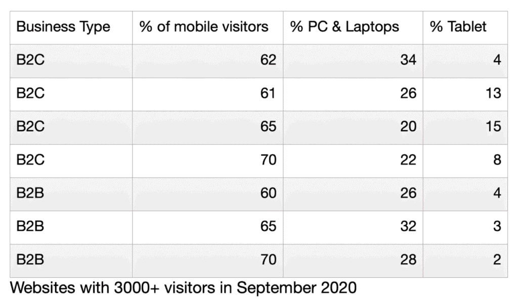
I was really surprised to see that the B2B websites had an even higher percentage of mobile visitors than B2C.
Slideshows are impactful on a big screen, but we are all moving away from that. We want to scroll when we’re ready, swipe when we’ve had enough or want to see the next picture. We just don’t want to wait anymore.
More reasons why slideshows are bad
- The web designer decides the speed each slide should be displayed, to give you enough time to marvel at the photograph or read the text on top of a photograph (please don’t!!)
- What if it’s too slow and you get bored – but on a mobile phone the next button isn’t displayed?
- What if it’s too fast, and you couldn’t read it all – this is particularly the case for international or low-literacy users.
There are clever ways to display a slideshow on a mobile phone, and do you know how? By not displaying it. I have checked a few websites of businesses that I know have a slideshow that works on a PC, but on the mobile phone the slides are displayed as images below one another.
Who should have a slideshow?
No-one. Nada.
Unless you don’t care about your website performing well in Google and you use a slideshow to do some cool branding displays.
I wouldn’t even recommend a photographer having a slideshow!
Allow your website visitors to look at your work (photos, products etc.) in their own preferred time. Let them swipe or scroll when they’re ready. Don’t tell them HOW they have to enjoy your website.
If you really really want one, put a video in place, but no slideshow.