Quick summary
Most websites don’t have a traffic problem, they have a user experience problem. Outdated tactics like pop-ups, sliders, slow load times and hidden navigation frustrate visitors, reduce trust and make it harder for people to take action. The simpler, faster and easier your website is to use, the more likely people are to stay, engage and convert.
Website tactics that used to work but now kill your conversions
Most websites don’t have a traffic problem. They have a conversion problem.
And often, that conversion problem comes down to one thing: user experience.
UX is simply how easy and enjoyable your website is to use. If your website feels clear, simple and helpful, people are more likely to stay. If it feels confusing, slow or annoying, people are more likely to leave.
Here are the website tactics that might look normal, modern or even clever, but can quietly damage your UX, your conversion rate, or both.
Carousels and sliders
Carousels are the rotating banners or image sliders you often see at the top of a homepage.
They used to be popular because they let businesses squeeze several messages into one space. The problem is that visitors rarely interact with them.
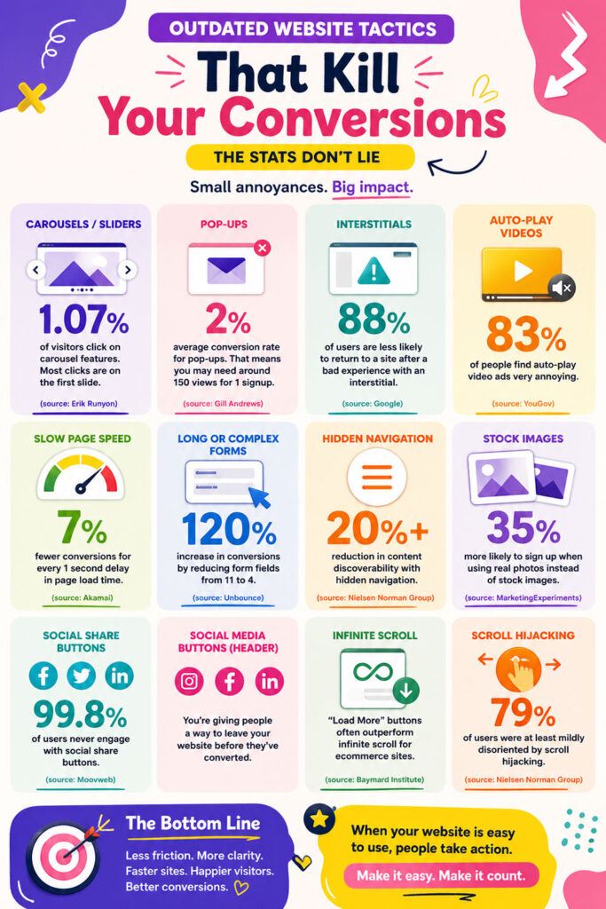
One study found that only 1.07% of website visitors clicked on carousel features, and most of those clicks were on the first slide (source).
That means almost everyone ignores them. And if people ignore the slider, they are missing your message.
What to do instead
- Use one clear headline
- Use one strong image
- Use one call to action
- Keep the homepage focused
Pop-ups
Pop-ups are boxes that appear on top of the page, often asking people to join a mailing list, claim a discount or book a call.
They can work in some cases, but they often appear too early. If someone has just arrived on your website, they have not had time to trust you yet.
Average pop-up conversion rates are often reported between 1.95% and 2.9%, meaning you may need around 150 pop-up views to get one signup (source).
That is a lot of interrupted visitors for one conversion.
What to do instead
- Do not show pop-ups immediately
- Use inline forms within the page
- Trigger pop-ups only after genuine engagement
- Make them easy to close
Interstitials
Interstitials are anything that blocks the content and forces the user to interact before they can continue.
Examples include full-screen newsletter prompts, app download prompts, cookie overlays, age verification screens and promotional messages.
Google has warned against intrusive interstitials on mobile because they make content less accessible to users (source).
The issue is simple: people came to do something, and the website gets in the way.
What to do instead
- Let people access the content first
- Use smaller, non-blocking prompts
- Keep required notices simple
- Avoid full-screen takeovers unless legally necessary
Auto-play videos and moving content
Auto-play videos and fast-moving visuals grab attention, but not always in a good way.
They can feel intrusive, especially when they start without permission. They also distract from the action you want someone to take.
A YouGov study found that 83% of ad-blocking users found auto-playing video ads very annoying (source).
Movement can also make a page harder to read, especially for users who are sensitive to motion or simply trying to focus.
What to do instead
- Let users choose to play videos
- Use static images first
- Keep animation subtle
- Never let movement compete with your call to action
Slow page speed
Slow websites lose people before they even get a chance to read your content.
Large images, heavy videos, too many scripts and bloated themes can all slow your website down.
A 1-second delay in page load time can reduce conversions by 7% (source).
People do not wait around. If your site is slow, they leave.
What to do instead
- Compress images
- Remove unnecessary scripts
- Avoid huge background videos
- Use fast hosting
- Test your website on mobile
Long or complex forms
Forms are often where conversions happen. They are also where conversions die.
If your form asks for too much information too soon, people hesitate. They worry about privacy, time and effort.
One case study found that reducing form fields from 11 to 4 increased form submissions by 160% and increased the conversion rate by 120% (source).
Another test found that making a phone number mandatory decreased conversions by 52% (source).
Every extra field adds friction.
What to do instead
- Ask only for what you need
- Make phone numbers optional where possible
- Keep enquiry forms short
- Collect extra details later
Hidden navigation
Hidden navigation usually means placing important menu links behind a hamburger icon.
This can work on mobile when space is limited, but it is often a problem on desktop websites. If people cannot see the navigation, they may not use it.
Nielsen Norman Group found that hidden navigation reduced content discoverability by more than 20%, increased task difficulty by 21%, and made tasks 39% slower on desktop (source).
Clean design is good, but hiding useful links can make the website harder to use.
What to do instead
- Show your key pages clearly
- Keep desktop navigation visible
- Use simple page labels
- Make it obvious where people should go next
Stock photos
Generic stock photos can make a website feel polished, but they can also make it feel fake.
If visitors have seen the same smiling headset person on ten other websites, it does not build trust.
In one A/B test, replacing a generic stock image with a real photo of the company founder made visitors 35% more likely to sign up for a free consultation (source).
People want to know who they are buying from. Real photos help with that.
What to do instead
- Use real photos of you
- Show your team
- Show your workspace
- Show your actual work or products
Social share buttons
Social share buttons let people share a page to Facebook, LinkedIn, X or other platforms.
They used to be everywhere, but most people do not use them now. They also add clutter and can distract from your main call to action.
A study of 61 million mobile sessions found that 99.8% of users never engaged with social share buttons (source).
If they are not being used, they do not need to be prominent.
What to do instead
- Remove them from service pages
- Keep them off sales pages
- Use a simple copy link option if needed
- Prioritise your own call to action
Social media buttons in the header
Social media buttons in the header are links to Instagram, Facebook, LinkedIn or other platforms placed at the top of your website.
They seem harmless, but they give people an easy way to leave your website before they have taken action.
This is especially risky if your main goal is enquiries, bookings, sales or email signups.
You have worked hard to get people onto your website. Do not send them straight back to social media.
What to do instead
- Remove social links from the header
- Move them to the footer
- Use muted styling
- Keep the header focused on your website goals
Infinite scroll
Infinite scroll means more content loads automatically as the user scrolls.
It works well on social media because people are browsing for entertainment. It is less useful on goal-based websites where people are trying to compare, choose or buy.
Research discussed by Baymard found that “Load More” buttons can outperform both pagination and infinite scrolling for ecommerce product lists (source).
The problem with infinite scroll is that users can lose their place. They may struggle to return to something they saw earlier, and too many choices can make decision-making harder.
What to do instead
- Use pagination for structured content
- Use a “Load more” button for product lists
- Help users keep their place
- Give users control over what loads next
Scroll hijacking
Scroll hijacking happens when a website changes the normal scrolling behaviour.
This could mean horizontal scrolling, forced animations, unusual scroll speeds or sections that move in unexpected ways.
Nielsen Norman Group found that most users in their study were at least mildly disoriented by scroll hijacking, and some tried to refresh or leave the page to regain control (source).
People expect scrolling to work normally. When it does not, they feel confused and out of control.
What to do instead
- Keep scrolling natural
- Avoid horizontal scrolling
- Do not force animations
- Let users move through the page at their own pace
The main lesson
Your website does not need more features. It needs fewer distractions.
Good UX usually means:
- Less friction
- More clarity
- Faster pages
- Clearer navigation
- Fewer interruptions
- More trust
If your website feels easy, people are more likely to convert.
If your website feels annoying, confusing or hard work, they leave.